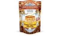
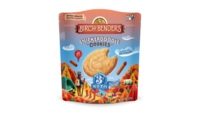
Birch Benders just announced a brand refresh, combining a new modern aesthetic with nature-themed scenery and animal mascots. This refresh includes a revamped logo, new packaging, and improved recipes, while staying true to Birch Benders’ commitment to simplicity and quality, per the brand.
Since its inception in 2011, Birch Benders has included nature-inspired packaging and pancake mixes made from simple, high-quality ingredients. Today, the brand is introducing a refreshed look that reflects its dedication to providing the clean-ingredient mixes in an even more engaging way.
“We wanted this exciting rebrand to resonate with the core of what Birch Benders stands for: delicious, simple, and fun,” says Dan Anglemyer, chief operating officer. “Our updated logo and packaging are designed to bring a fresh, vibrant energy to our products while honoring the whimsical elements that have been a hallmark of our brand.
Key elements of the brand refresh include:
- New logo: The reimagined logo features a modernized design that retains the essence of the original. Set within a stately plaque, the letterforms highlight the brand’s whimsy, and the birch tree arching over the top pays homage to founders Matt and Lizzy.
- New packaging: From the fiery orange leaves of an autumn birch to the periwinkle sky over the mountains, each of the company's illustrative product settings is a gateway to a great big world. Each package tells its own story through imagery and offers an invitation into the Birch Benders world of pancakes.
- Improved recipes: Birch Benders continues to enhance its recipes by simplifying ingredients and reducing allergens.
Birch Benders is now available in its updated packaging at most retailers nationwide including Whole Foods, Target, and Sprouts.


